BlueStone Box Website

A newcomer to the market, this client started with a blank online slate in a unique product niche. Learn how we rose to the challenge, sculpting a brand-new online identity, smoothing the shopping journey, and making sure customers felt right at home.

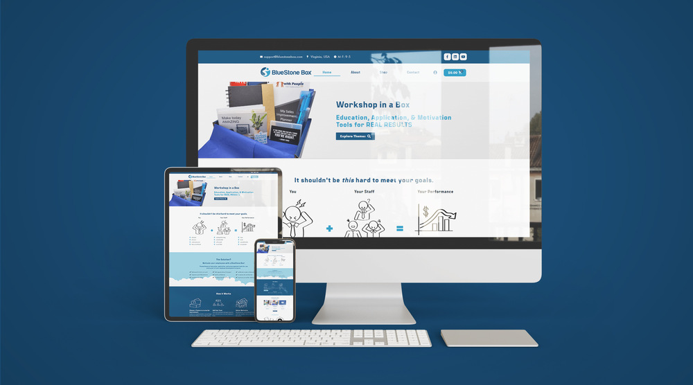
Goal

BlueStone Box, a fresh face in a one-of-a-kind market, had no digital trace to their name. Our mission: to turn their absence into an attention-grabbing presence.

Our focus was two-fold – creating an identity that resonated and a shopping experience that was smooth as silk.

Mood Board

Results

Features: E-Commerce, Fast Checkout, Payment Integration

The journey began with a robust brand strategy. We delved into BlueStone Box’s core essence, transforming their story into an unmistakable brand voice. Armed with this, we weaved an engaging narrative into their web pages, ensuring that every click evoked a connection.

Now, for the tech magic! We harnessed the power of WooCommerce, a top-notch e-commerce platform, to construct a virtual shop that seamlessly integrated into their brand’s universe. And that’s not all – for an impeccable shopping expedition, we integrated a speedy checkout option. No long queues, no virtual waiting rooms. Just pure efficiency.

As for the design aspects, we conceptualized and designed custom icons that spelled out the ordering process visually. These little graphic marvels acted as guides, making the journey from product selection to final checkout crystal clear and oh-so-engaging.

Desktop Mockup

Rave Review

Client's Feedback