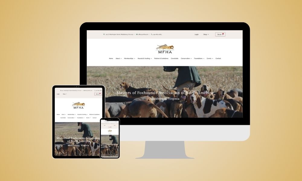
Masters of Foxhounds Association Website

For generations, the Masters of Foxhounds Association of North America (MFHA) has been the cornerstone of organized mounted hunting with hounds in the US and Canada. Now, with a revamped website, the MFHA enters a new chapter, seamlessly blending their established identity with a modern and functional online experience.

Goal

The MFHA’s existing website, while recognized by its membership, presented several challenges. Inconsistent design, difficulties with backend updates, and limited functionality hampered their ability to effectively communicate with their members and the public. However, maintaining familiarity and trust amongst established members was a crucial priority.

Mood Board

Results

Features: Advanced Custom Blog, Custom Fields, Document Library

We approached the project with a focus on respect and modernization. Here’s how we revitalized the MFHA’s online presence:

  • Familiar and refined: We preserved the core design elements, ensuring a sense of continuity for long-standing members. However, subtle improvements were made to enhance consistency, visual appeal, and user-friendliness across all pages.
  • A smoother user experience: We migrated the website to a user-friendly builder, empowering the MFHA team to easily manage content updates and maintain the website themselves.
  • Mobile-first mentality: In today’s digital world, mobile responsiveness is crucial. We ensured the website adapts seamlessly to all devices, allowing users to access information and connect with the MFHA on the go.
  • Streamlined navigation: We carefully reviewed the existing navigation structure and made subtle adjustments to improve intuitiveness and user-friendliness, making it easier for visitors to find the information they seek.
Desktop Mockup

Rave Review

Client's Feedback