
Society continues to evolve with mobility, including using mobile devices for banking, shopping, browsing, and other common tasks. We all love our mobile devices, which now generate more than half of all web traffic. Providing your target audience with an enjoyable mobile browsing experience will help you reach out to them more effectively.
Like you, we strive for website mobile optimization that suits the needs and preferences of mobile visitors without any hassles. The knowledge and tools we will provide will ensure that mobile visitors can navigate your site, access your content, and interact with your brand in a friendly and positive manner, improving your responsiveness, page speed, file size, load times, and meta descriptions. So with that said, let’s get started!
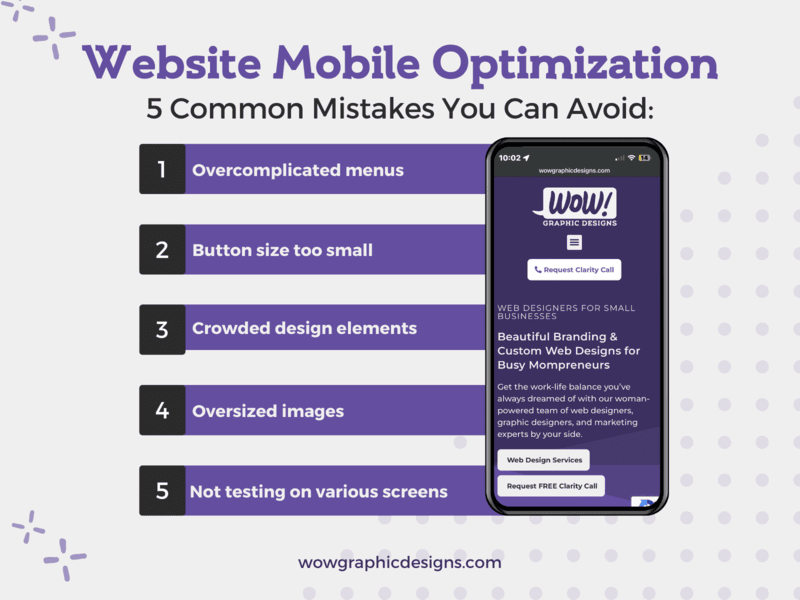
Optimize Website for Mobile: One Design Does Not Fit All
Businesses often make the mistake of assuming that one size (or design) fits all. As mobile users glued to our phones, we fear missing out or being disconnected. The design and functionality of your website are important if you want to have a successful site. Mobile sites are not just a smaller version of the site but a design that focuses on key visual elements. You need a website that does not annoy visitors with unnecessary components.
As an internet user, you want to know what is happening in the world—search for information or inform others. Basically, your computer is a powerful tool at home. Because they are smaller and easier to carry around, prioritizing your experience with a mobile site should be the most important aspect when venturing outdoors. We tend to focus on screen size, particularly for tablets. Size matters to most users and can differ on mobile devices as some have more limited screen space than others.
1. Overcomplicated Menus
Sadly, we have experienced overcomplicated menus many times. An easy menu is important on a mobile website. In light of the smaller screen size of mobile devices, optimizing a website’s design and functionality for mobile users can help them read emails, write, or even have a face-to-face conversation with the touch of a finger. The navigation menu is one of the key elements of mobile sites.
You are not alone if you have struggled to access and find navigation menus. Some businesses are still learning the ropes of creating a mobile-friendly site. The menu should be easily accessible from any page on the website. An accessible navigation menu and clear, concise labels for each item would make mobile experiences a breeze.
Mitigating the Risk of Losing Visitors
For the convenience of a mobile user, menus should be concise. It’s a good idea to conduct user testing to determine which links are most important to mobile devices. We, as mobile users, tend to have a shorter attention span than when using a desktop, and mobile usage is growing daily. We want a menu that is simple and up-to-date. Doing so will enable mobile users to easily navigate your website and locate the required information without hair-pulling.
The problem that can follow, if overlooked or underestimated, could be significant and far-reaching, potentially leading to fewer or lost visitors. Acknowledging and understanding its magnitude is crucial when taking the appropriate actions to resolve these issues. Taking such measures will enable you to mitigate any potential risks and adverse effects in advance and ensure the best decisions are made.
2. Button Size
Don’t you just hate when you try to click a small button on the mobile screen, and it goes nowhere as a result? A typical oversight businesses make when optimizing their websites for mobile devices is not adjusting the size of their buttons to facilitate finger taps. As humans, we are always learning; sometimes, it takes longer than usual, especially regarding technology. Website buttons play an important role in user engagement and interaction. A poorly sized or positioned button can lead to user frustration, negatively impacting their experience on your website.
As a user, your experience should be positive, and when designing a mobile version of your site, we ensure that all buttons are sized appropriately to make tapping easy. Mobile-first marketing initiatives are growing daily with the mobile experience involving the incorporation of push notifications, which are becoming increasingly popular for mobile usage.
To ensure your website is mobile-friendly so people do not go crazy with confusion, web developers and business owners should factor button size and placement into their marketing strategies. Mobile-friendly websites provide an optimal browsing experience for mobile device users, which can influence your marketing growth.
3. Crowded Elements
Mobile devices represent a significant portion of your website’s traffic, as you can take that traffic everywhere with you in the palm of your hand or pocket. Mobile optimization and mobile-friendliness are vital to a search engine such as Google.
With the proper spacing between touch targets, navigation would be easier. If everything is jam-packed and close together, we may tap something we did not intend to. An effective mobile-first marketing strategy also involves designing websites for mobile devices and using structured data. This would be great for improving search engine visibility. Implementing a mobile-first approach consists of creating mobile device sites and using structured data to enhance search engine visibility.
Improving mobile optimization, including optimizing images and videos, compressing files for faster loading times, and using a content delivery network (CDN) to reduce latency, would be a blessing. You can make your website more mobile-friendly and accessible to a broader audience by following specific steps that can help with structured data, web designs, and more, all from the palm of your hand wherever you are, whether it’s a coffee shop, your home, a cinema (just put your device on silent if at the cinema).
4. Oversized Images
Taking pictures is an everyday part of our lives. Even some cultures cannot go 15 minutes without taking a picture. Focusing on restructuring the image size can save space. Optimizing images and avoiding large file sizes that slow down site loading time is crucial to ensure a seamless browsing experience on mobile and business websites. Some of us tend to avoid large files knowing that they take up space on our mobile devices.
We all use more than one mobile device, right? Tablets, phones, laptops, smartwatches, etc. You can optimize your site for cross-device use with a responsive design and media queries. As for media queries, they are pretty awesome as they allow you to apply different styles to different devices based on screen size. The layout and colors adapt to the screen size and orientation on a responsive site, which is necessary to our way of life as we like colors and pretty much anything that stands out.
When optimizing images for your site, consider compressing them to reduce their file size while maintaining quality. This, however, is easier said than done, but if done right, it will save space. In addition to JPEG and PNG, you can use web-optimized image formats. The performance of your website can also improve by optimizing content and videos.
Avoiding oversized images and focusing on a responsive design and optimized content, you can create a mobile-friendly site that provides users with a seamless browsing experience on any device. Using something like responsive design, which focuses on media queries, is a good start, as media queries target the layout of the screen, which can help the pixels of an image.
5. No Testing
Tests should focus on a mobile-optimized website, user experience, and screen sizes. Sometimes we rush things, and doing so could negatively impact our strategy. Other than prioritizing a mobile responsive design and optimization, including improving your page speed and adhering to Core Web Vitals.
We all love to use Google, so the Google Search Console is a valuable tool for monitoring website performance and identifying potential issues that may affect our everyday mobile experience. Have you ever swept something under the rug, thinking it would take care of itself? Or what about out of sight, out of mind? These thoughts can damage any business, so a business should improve its site’s functionality and usability for mobile phones if they focus on checking its metrics and addressing issues.
Mobile-Optimized Web Design With Mobile Users in Mind
Mobile optimization should focus on a mobile-first design as it is an important aspect of web design. Google is well aware of this. As a mobile device user, you, too, should be mindful that it does an impressive job with its website optimization, as it can use mobile optimization to keep attracting us. This would be great for smaller screens and help avoid common mistakes on your website to maximize its success.
Why settle for a subpar website that fails to deliver an exceptional user experience that may make you throw your phone against the wall? Ensure your website is always at its best by testing early and often. When you please your users, you satisfy yourself with the feeling of success.
Our professional team specializes in mobile optimization and can help you create a mobile-optimized site that meets the Core Web Vitals benchmarks for a seamless user experience.
Mobile-optimized sites are a major consideration for enhancing user experience and ranking higher in search res. Factors like site loads, load times, and website content are critical for a successful online experience.
Mobile device optimization can be challenging whether you are a beginner or have experience in this field. It can also be time-consuming and at WoW! Graphic Designs, we understand this and empathize with you. Through us, you will be taken good care of, so there is no need to feel stressed over the website issues experienced on a mobile device. Our experts have the experience and knowledge to create a responsive web design to ensure your mobile site is optimized to meet the Core Web Vitals and other industry standards.
We all want to be successful, and in today’s crowded digital market, our expert team provides top-notch mobile optimization and responsive web design services to help you with your growth.
Who should you call to help you? WoW! Graphic Designs. Our recommendations will catapult your website to the forefront of the mobile revolution. Get ready to leverage loyalty and stand out in 2023!
Transform Your Customer’s Journey and Your Business Today
We at WoW! Graphic Designs hope you can expand your online presence and bring more people closer to your brand by having us create your mobile-optimized website. If you need help building your site, give us a shout.